
A new year means a new Color of The Year! A beautiful new COTY has been unveiled by PANTONE® to help inspire design in every industry. Pantone's choice for 2013 is Emerald, a color that encompasses freshness and clarity and is sure to make an impact.
How does Pantone choose the Color of The Year?
Every year, PANTONE® scours the world for color influences in their quest to find the Color Of The Year. This includes looking at color use in various industries, major events that have garnered worldwide attention such as sporting events or political elections, availability of new textures or color-related technology, socio-economic conditions, or new artistic styles that are popular.
After compiling data gathered over 2012, Pantone then carefully looks for patterns in color use and chooses a color that best reflects the 'feel' of the most commonly used colors with an eye towards predicting color use over the next year.
Why was Emerald chosen to represent 2012?
2013's Color of The Year is Emerald, a beautiful cool green reminiscent of the jewel that is it's namesake. Emerald was chosen for it's feeling of rejuvenation and clarity; traits that are useful in the wake of a new era.
December of 2012 marked the end and beginning of a 30,000-year calendar cycle for the Mayans, leaving behind the old era and ushering in a new one. In today's world, we are quickly moving forward in an era that is more focused on connecting to each other and the planet we live on.
We are shedding the old-era thinking of independent, autonomous living, and embracing unity and collective thinking. This event brings with it a sense of renewal and rejuvenation found in the color green.
Additionally, green is being used to represent a natural approach, such as 'going green'. We are becoming more environmentally concerned as we become more conscious of the impact we have on the world around us. We associate nature with the color green because of the prevalence of this color in plants.
Color theory behind the color green
Green is the most common color found in nature and is also the most visible color on the color spectrum, making this it very easy on the eyes. In general, green is most heavily associated with renewal, regeneration, freshness, nature, harmony, inexperience, and fertility. Like every color, different variations of the shade can create a subtle yet noticeable difference in impact.
For example, olive green has an authoritative feel and is also used to represent peace. Yellow-green feels more energetic and is often associated with nausea or sickness, while dark green is associated with jealousy, greed, and ambition.
Emerald's deep, rich shade elicits a feeling of luxury and sophistication pulled from the association to the precious gem. Clarity is a unique trait to Emerald, again imparted by the much sought-after clarity of the gemstone. Green also emanates a feeling of regeneration. Leaning slightly more into blue than a standard green allows the color emerald to have a feeling of healing that is oftentimes more commonly associated to turquoise.
The Prevalence of Turquoise
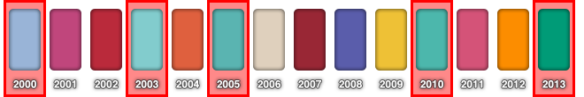

It is interesting to note that over the course of the last dozen years, turquoise has been the favorite color choice for Pantone's COTY. The color turquoise has been linked to creating emotional stability and healing, so it is no surprise that we regularly turn to this color for comfort. A variant of this color was chosen in 2003, 2005, and 2010. What is even more interesting is looking at the subtle shift in the 'favorite' color from blue to green.
If we look at 2000's Cerulean Blue and subtract the green from the blue value, we see that blue is more prevalent by 32 values. As we move into 2003's Aqua sky, we see that it is a perfect mix of blue and green. Looking at 2005's Blue Turquoise, we see a shift in dominance to green by 4 values. 2010's Turquoise is even greener at 12 values, with Emerald completing the move into green with 36 values.
This subtle shift from blue to green is interesting because we can come to the conclusion that turquoise is the color of the decade. Looking at the data, we can also come up with the prediction that the next decade will be dominated by green as the 'favorite' recurring color shifts away from blue and into green.