Color is one of the many tools we use to define the world around us. We often use color to describe our mood or setting. We use color to warn, excite, entice, scare, and advertise. We also subconsciously use color to define periods of time.
Color is perceived the same universally but has slight cultural differences in interpretation. Regardless of culture, it has a strong emotional impact on the human brain. There are certain colors in nature that universally signal danger, as found in the brightly colored and venomous Eastern Coral Snake and in poisonous Holly Berries.
This means that every one of us are naturally hard wired to react to and interpret color-whether or not we are aware of it! That is why color is important among artists, designers, and advertisers- because color is a 'quick reference guide' for tapping into instinctual human behavior.
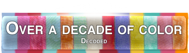
Color- A History
Color is so important that it has it's own industry standard. Pantone® is an institution that has helped create an industry standard in color for more than 45 years. In the early 1960's there were problems associated with producing accurate color matches in the graphic arts industry. This led to the creation of Pantone® Matching System® (a book of named colors given an alpha-numeric code to catalog them) created by Lawrence Herbert- Pantone's founder. Pantone® has become the standard in color for color-critical industries such as fashion, home, digital technology, architecture and interiors, plastics, paint, and print industries- to name a few.
Color Of The Year(COTY)
Every year Pantone chooses a Color Of The Year that represents the emotion of the world. The color is chosen based on what is happening in the world at that time and is meant to inspire design and innovation in all fields. When we take every COTY in the last 12 years and line them up, we get a surprisingly accurate consensus of the state of the world over time. A timeline in color preferences that follows the ever changing mood of the world.
Below is a timeline of the emotion of the world broken down into color:
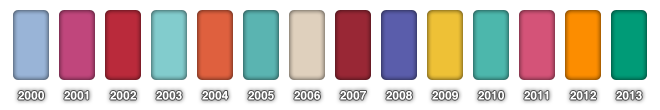

Cerulean Blue: Pantone 15-4020 TCX
"Chosen for the millennium for it's calming zen state of mind." -PANTONE®
The turn of the millennium was a hectic one. With the stress of Y2K and worldwide apocalyptic fears people needed something to comfort them in a time of uncertainty. Blue has always shown to be a soothing color associated with stability, tranquility, depth, loyalty, piety, and cleanliness, and has been shown to slow human metabolism and produce a calming effect. During times of stress people often turn to light colors to soften their fears.

Fuchsia Rose: Pantone 75-2031 TCX
"A reversal from the previous year, more exciting, more feminine and sexy." -PANTONE®
As people's fears about the new millennium began to subside, they began to look for something to invigorate and energize them. Pink is generally associated with playfulness, youth, health, delicacy, contentment, and tenderness. When pink leans more heavily into red it energizes the color. Fuchsia Rose is a representation of the populaces shedding their old fears and being reborn into a new and optimistic era.

True Red: Pantone 119-1664 TCX
"Recognizes the impact of 9/11 with a patriotic hue." -PANTONE®
2001 was a devastating year that set the tone for the new millennium. The 9/11 attack on the US left many people feeling angry, shocked, scared, and generally uneasy. Red has been known to be an invigorating color associated with fire, blood, and strong emotions. Red is synonymous with anger, love, war, heat, energy, strength, power, courage, determination, passion, desire, and love. True Red was chosen to help reflect a patriotic mood for the masses in a time when war was on the forefront of every mind.

Aqua Sky: Pantone 14-4811 TCX
"A cool blue meant to restore hope and serenity." -PANTONE®
2003 COTY's Aqua Sky is a reversal from the year before. Reversals are common in COTY and are created out of the masses' want for something so different it goes into the extreme. Contrasting to the agitated emotional state of the year before, Aqua Sky was chosen as a reflection of the hope and optimism that was originally felt with the new millennium. Aqua Sky's blue leans more into green which adds an element of healing associated with the latter.

Tiger Lily: Pantone 17-1456 TCX
"Acknowledges the hipness of orange, with a touch of exoticism." -PANTONE®
2004 was a time of rebuilding. Tiger Lily is an orange chosen for it's association with creativity, success, encouragement, stimulation, collaboration, determination, health, enthusiasm, and rejuvenation. It is, again, a reversal from the year before and a perfect complimentary color to it as well, continuing the feeling of renewal. Orange pulls its associations from a combination of red and yellow; red gives orange it's energy and yellow lends it's positivity and happiness. Nonetheless, orange is not as aggressive as red which allows for the easy exchange of ideas needed for growth.

Blue Turquoise: Pantone 15-5217 TCX
"Another reversal to a calming shade." -PANTONE®
2005 COTY is a hand-me-down color from 2003's Aqua Sky. With a touch more green than Aqua Sky, the main choice for this color came from the associations of tranquility felt while gazing out over the ocean at the horizon. Blue Turquoise represents the need to look ahead to the future while bringing to light the want to escape from troubling times.

Sand Dollar: Pantone 13-1106 TCX
"A neutral color that expresses concern about the economy." -PANTONE®
In 2006 the western world was hit with The Great Housing Depression. This was a time following a boon in housing sales which spurred one of the worst housing crisis in western history and in turn set the tone for the future of the world economy. It is not surprising to find that 2006's COTY was Sand Dollar, a neutral color chosen to inspire reflection and farsightedness. Sand Dollar has an organic origin and inspires feelings of safety and stability.

Chili Pepper: Pantone 19-1557 TCX
"Chosen for its pizazz and sophistication and its hint of ethnic taste." -PANTONE®
The economy's downturn created a sense of panic. Many people lost their homes, jobs, and assets while trying to adjust to the economic depression. This led to a rash of people taking big risks in the hopes of finding a different means of living. Chili Pepper was chosen as a reflection of the spirit of adventure and individuality.

Blue Iris: Pantone 18-3943 TCX
"A multifaceted hue reflecting the complexity of the world that surrounds us." -PANTONE®
Purple is one of those shifting, difficult-to-place colors. Both warm and cool, no wonder that it is associated with magic, mystery, royalty, change, power, meditation, nobility, and spirituality. The western 2008 presidential election signaled a sweep of change that moved more than just politics. 2008's COTY Blue Iris leans more into blue than red, implying a sense of tranquility and anchorage without losing it's feeling of energy.

Mimosa: Pantone 14-0848 TCX
"Mimosa embodies hopefulness and reassurance in a climate of change." -PANTONE®
Pantone got it right when they said that there was a 'climate of change' in a time of political transition. Mimosa is a warm color and is associated with optimism, joy, hope, and nurturing; which is everything that is felt when choosing a leader.

Turquoise: Pantone 15-5519 TCX
"Turquoise transports us to an exciting, tropical paradise while offering a sense of protection and healing in stressful times." -PANTONE®
Stressful times make people crave release. Turquoise is the go-to color of this decade for soothing escapes and rejuvenation. It is a hopeful, clean, and optimistic color to usher in the new decade with.

Honeysuckle: Pantone 18-2120
"In times of stress, we need something to lift our spirits. Honeysuckle is a captivating, stimulating color that gets the adrenaline going– perfect to ward off the blues." -PANTONE®
A new decade deserves an energetic color. An interesting note here is the pattern of starting the new decade on an energetic shade of pink, such as in 2001's COTY Fuchsia Rose.

Tangerine Tango: Pantone 17-1463 TCX
"The 2011 Color Of The Year, PANTONE 18-2120 Honeysuckle, encouraged us to face everyday troubles with verve and vigor. Tangerine Tango, a spirited reddish-orange, continues to provide the energy we need to recharge and move forward." -PANTONE®
Tangerine Tango was chosen to help motivate and energize the masses in 2012. This hip, exotic color is associated with youthful energy and individuality. Here's to hoping it is put to good use in 2012!

Emerald: Pantone 17-5641 TCX
"Lively. Radient. Lush... a color of elegance and beauty that enhances our sense of well-being, balance, and harmony." -PANTONE®
Emerald is a reversal from 2012's Tangerine Tango. Green has strong emotional ties to safety, renewal, freshness, and growth. In our more tightly connected world, change is occurring faster than ever in every field of study, and new fields are opening up at an exponential rate. Emerald has been chosen to reflect the sense of renewal and growth that is attributed to increased technology and collaboration, while also lending a sense of comfort to sooth the anxiety that sometimes accompanies change.